Lab 3: Two Column Layout
This lab will show you how to create a two column layout.
Download the Two Column Template
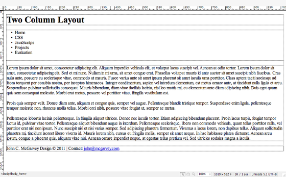
Download the two_column_template.html file and open it in Dreamweaver. Also download a header image (I have given you several to choose from) file and save it into your images folder nested inside your 513 root directory. Name the file lab3_2col.html.
If you want to use your own image make sure the width is 960 pixels and the height is 200 px.
Review the XHTML

Go to code view and review the structure of the 2 column template file. All of the divs are nested within a container div. There is also a second div with the id nav which will be used to create a left hand column for the main navigation. Inside this div is an unordered list which will be styled as the main navigation buttons later.
One of the paragraphs has a class of note which will be used to create a pull quote later.
The template also has the usual header, footer, and content divs.
Clear the margins and padding and add some default styles
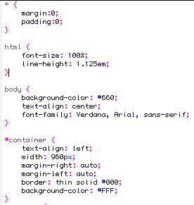
Create a new custom external css file named lab3.css and save it to your CSS folder. Link the file within the head section of your lab3_2col.html page.
<link href="css/lab3.css" rel="stylesheet" type="text/css" />
The first step is to reset the margins and padding to 0 px and then create some default styles for the html and body tags. This should look familiar to you by now. I am just setting some text styles and the background color for the page. Feel free to experiment with your own color scheme.
For the container div, I am creating a fixed width layout at 960px with a styled border. I set the left and right margins to the container div to auto so it would be centered in the browser. I gave the container a background color of white and made sure the text was aligned left.
Define the header and footer styles
Like we have done in the past, I am just going to set some default styles for my header and footer divs. You can add background images, like I have done in this example or set some background colors.
#header {
background-image: url(../images/redwood_rings.jpg);
background-repeat: no-repeat;
height: 190px;
padding-right: 20px;
padding-left: 20px;
padding-bottom: 0px;
padding-top: 10px;
background-color: #FFF;
}
#footer {
clear: both; /*Forces footer below both columns*/
padding-top: 20px;
padding-right: 20px;
padding-bottom: 10px;
padding-left: 20px;
font-size: 80%;
color: #A6AD00;
background-color: #A9421F;
text-align: right;
background-image: url(../images/moss.jpg);
height: 75px;
}
To make sure that the footer clears, both of the columns you need to add the clear: both: declaration.
Understanding the CSS Box Model

With CSS you can define the height and width of your content and constrain it with padding and give it a margin. The border is in-between your padding and margin. If you add a background image it will be stacked on top of the defined background color.
Now, in order to understand how to use CSS to create columns in a layout it is important to know that your padding and margin is ADDED to your height and width to come up with the total amount of space your div will take up on your web page. If you have a div with a width of 200px, padding of 5px and a margin of 10px. The total amount of space that your column will take up in your design is 230px.
Content width 200 px + left and right padding (5px each) 10px + left and right margin (10px each) 20px = 230px
Illustration by Jon Hicks at http://hicksdesign.co.uk/else/images/3d_box_model-01-20100705-214448.png
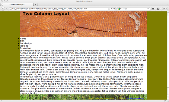
Create the Two Column Layout: Style the Content and Nav divs
In our design, since we defined the total width of our container div to 960 pixels this is the amount of space we have to work with to create our two columns. This will also have to include any padding and margins that we might want to have on each column.
We have a main content div and a nav div. The first column is going to be for our navigation. I want the buttons to run right up to the border of the container so I am not going to adding any padding or margins. I will set the width of the nav div to 200 pixels and made sure it is a block element. I want the nav div to float to the left and have the main content wrap around it to the right. This is done with the float: left declaration.
#nav {
background-color: #A6AD00;
width: 200px;
float: left;
display: block;
}
If you subtract 200px from 960px you are left with 760 pixels to work with to create your main content div. I want to add 20 pixels of padding to the right of the main content and I have to set the left margin to be large enough to include the width of nav div and the amount of white space I want between the two columns (20px). If you subtract 20 pixels from 760 for the right padding and 20 pixels for the left margin (width of the white space in addition to the 200 pixel width of the nav div), you are left with 720 pixels for the width of the content div.
#content {
padding-top: 20px;
margin-left: 220px; /*20 pixels of white space and 200 pixels for the width of the nav div */
width: 720px;
padding-right: 20px;
}
Add some Heading and Paragraph Text Style

I defined a font and text color for my headings and added some padding to the bottom of my paragraphs. Remember when you clear your margin and padding to all your tag selectors, you have to go back and add them to your paragraphs.
p {
padding-bottom: 1.5em;
}
h1, h2, h3, h4, h5, h6 {
font-family: "Trebuchet MS", Arial, Helvetica, sans-serif;
color: #B0BF00;
}
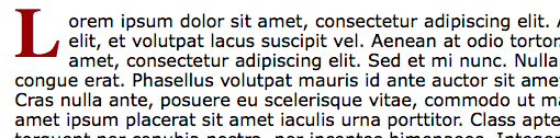
Extra Style: Add a Drop Cap with CSS
We are going to create a new external css file named lab3_text.css and save it into the css folder. Link this style sheet to the head section of your template.
<link href="css/lab3_text.css" rel="stylesheet" type="text/css" />
We are going to create a drop cap effect using the :first pseudo class selector. Pseudo-Classes are used to add special effects to some selectors. They are often added to classes in this format: selector.class:pseudo-class {property:value;}
For our drop cap, we are going to create a selector that will be only applied to the first letter of the paragraph with the class intro.
p.intro:first-letter {
font-family: "Century Gothic Bold Italic", "Old English", serif;
font-size: 400%;
line-height: 0.9em;
font-weight: bold;
color: #900;
float: left;
margin-right: 0.05em;
padding-top: 0px;
padding-right: 0.05em;
padding-bottom: 0.02em;
}
In this style, we defined a custom font at a large size with a bold color that is floated to the left, forcing the rest of the paragraph to wrap to the right of the letter.
If you look at the XHTML source code of our template, you can see that we added a custom class to the first paragraph of the content div.
<p class="intro">
Extra Style: Creating a Pull Quote Effect

Our next text effect will a pull quote and it will also be added to the lab3_text.css external style sheet.
The pull quote is going to float to the right and force the rest of the paragraphs to wrap around it to the left. The text will be slightly smaller, italic, and be given a top and bottom border.
Add the following style selector to your labe3_text.css style sheet. Review your xhtml code and make sure one of the paragraphs has been given a note class.
.note {
font-size: 0.8em;
font-style: italic;
width: 40%;
margin-bottom: 1em;
margin-left: 1em;
padding-top: 0.3em;
padding-right: 0.4em;
padding-bottom: 0.3em;
padding-left: 0.4em;
border-top-width: 2px;
border-bottom-width: 2px;
border-top-style: double;
border-bottom-style: double;
border-top-color: #900;
border-bottom-color: #900;
float: right;
color: #900;
}
Two Column Layout
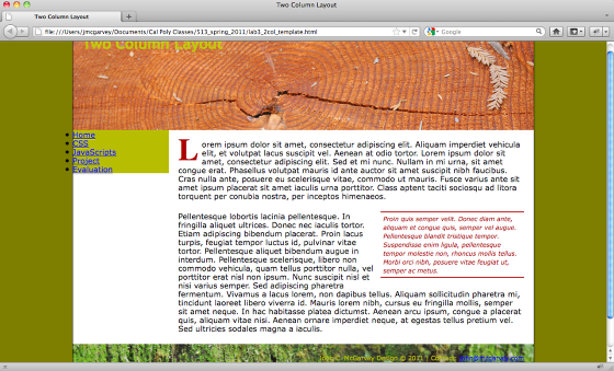
This is the look of the two column layout. The final step to define the style for our vertical navigation bar. Create a third external style sheet named vert_nav.css and save it into your CSS sub folder. Link the file to your template. You have now have three different external style sheets for this page. One defines the layout of your divs, one the special text style, and the third one creates the vertical navigation bar. Your head section should look something like this:
<head>
<meta http-equiv="Content-Type" content="text/html; charset=UTF-8" />
<title>Two Column Layout</title>
<link href="css/lab3.css" rel="stylesheet" type="text/css" />
<link href="css/vert_nav.css" rel="stylesheet" type="text/css" />
<link href="css/lab3_text.css" rel="stylesheet" type="text/css" />
</head>
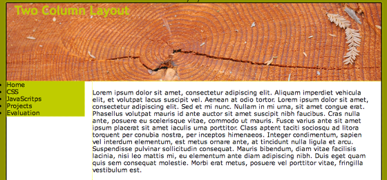
Vertical Navigation buttons
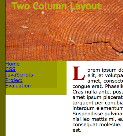
The first step is to eliminate the bullets from the unordered list and give the list a set width.
#nav ul {
list-style-type: none;
padding: 0px;
vertical-align: bottom;
background-color: #990;
width: 170; /*Change width to a set pixel width */
margin-top: 0px;
margin-right: 0px;
margin-bottom: 1.5em;
margin-left: 0px;
}
Turn the Unordered Lists into Buttons

The trick to make the unordered list look like a button is to display the <li>tag as a block instead of inline element. Next, the links are given a style to make them look like buttons.
#nav li {
display: block;
}
#nav li a {
display:block;
text-decoration: none;
padding: 0 15px;
line-height: 2.5;
border-bottom: 1px solid #fff;
color: #900;
background-color: #A6AD00;
padding: 0.2em 1em;
/*Delete float left */
}
Make the buttons roll overs
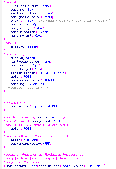
View the XHTML source code and look at the unordered list and notice how each <li> tag was given it's own unique ID. This will allow you to apply a custom style to just the top and bottom buttons. Using these selectors to eliminate the border on the bottom button and add a border to the top button. Next, add a custom roll over effect with the a:hover pseudo-class.
#nav_hom a {
border-top: 1px solid #fff;
}
#nav #nav_con a { border: none; }
#nav a:hover { background: #FFF; }
#nav li a:link, #nav li a:visited {
color: #900;
}
#nav li a:hover, #nav li a:active {
color: #A6AD00;
background-color:#FFF;
}
By adding a unique id to the body tag of each page of your site, you could define the style for the button of the current page to look differently from the rest of the buttons.
#body_hom #nav_hom a, #body_css #nav_css a,
#body_js #nav_js a, #body_prj #nav_prj a,
#body_eval #nav_eval a
{ background: #fff;font-weight: bold; color: #A6AD00; }
Final Design with a Vertical Navigation Bar

See the final design above.
Save and upload the files to the server. Link to your Lab 3 assignment on my website.