3 Column Layout Lesson
In this lesson, you will learn how to create a three column layout.
Open the 2 Column Layout
Open the 2 column layout template from last week. We are going to add a third column to this layout.
Add the sidebar div to the XHTML file
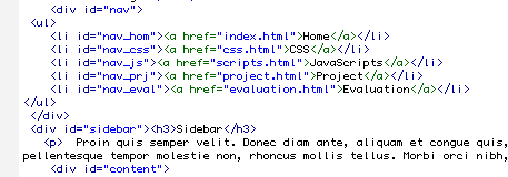
Look into the source code and add a div tag right after the nav div and before the content div. Give the div the id = sidebar. Add a he header and a paragraph inside your sidebar.
Code:
<div id="sidebar">
<h3>Sidebar</h3>
<p>Add sidebar text here.</p>
</div>
Create a New CSS File
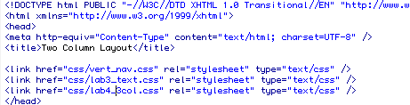
Open the lab3.css file and save it as lab4_3col.css.
Look between the head tags of your source code and find the link tag that embedded the lab3.css file. You need to change this to link to your new lab3_3col.css file.
The new link tag should look like this:
<link href="css/lab4_3col.css" rel="stylesheet" type="text/css" />
Create Room for the Sidebar
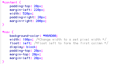
We have to update our CSS file to create room for our third column. Review the linked lab4_3col.css file and find the container div. What is the width of your container? This is the total amount of space that will be available for your three columns.In our two column layout, the container div was 960 pixels wide.
Remember, you have to include the divs padding, margin, border width, and element width in figuring out how much space each div will need.
In order to make space for the sidebar, we are going to remove 200 pixels from the width of the content div. Find the content div and change the width rule to 520 px.
Update the padding and margin in your nav style declaration.
#nav {
background-color: #A6AD00;
width: 180px; /*Change width to a set pixel width */
float: left; /*Float left to form the first collmn */
display: block;
padding-top: 20px;
margin-top: 20px;
margin-left: 20px;
}
With these changes the nav div is now taking up 200 pixels of space while the content div is taking up 560 pixels of space. If you subtract these 760 pixels from 960 pixesl we are left with 200 pixels for the sidebar.
Code the Sidebar in CSS
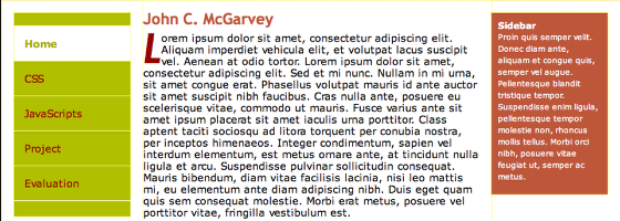
Our next step is to code the sidebar div in CSS. We want the sidebar to float to the right. We have 200 pixels of space to work with so I set the width to 160px, the right right margin to 20px ,and the left and right padding to 10 pixels (160 + 20 + 10 +10 = 200). You can customize the rest of the styles to your preferences.
#sidebar {
float: right;
width: 160px;
background-color: #A54931;
color: #FFF;
margin-top: 20px;
margin-right: 20px;
font-size: 79%;
padding: 10px;
}
Final 3 Column Layout: The rest of the stylesheet should be them same
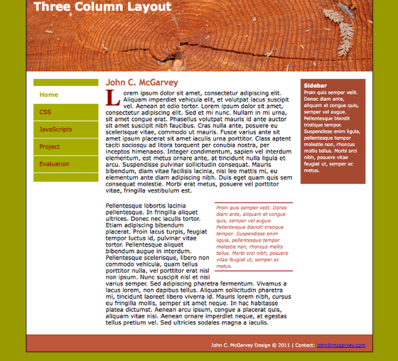
The rest of the stylesheet should be the same from last week. I didn't want the backgrounds to continue all the way to the footer so I removed any background images from the container div that were used to create the illusion of columns. During another session we will add rounded corners to these divs using JavaScript or CSS 3.
As a reminder make sure your footer has the declaration
#footer {
clear: both;
}
that is the key to make sure the footer is below all three columns.
The final layout should look like the above image.